Introduction
The inbox is a battlefield, and your email template is your armor—so why wear what everyone else is wearing? Most “templates” look like… well, templates. Same layout, same flow, same feel. But today’s consumers expect more. They expect clean design, mobile performance, and experiences that feel personal—not mass-produced. In this article, we’ll explore how to design custom email templates that break the mold, perform across devices, and set a new UX benchmark without sacrificing scalability.
Stop Copy-Pasting—Start with Modular, Brand-First Design
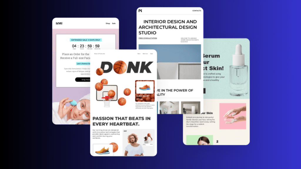
Many email templates look the same because they rely on basic, copy-paste designs. But smart brands are now using modular templates—custom email marketing templates built with flexible blocks that match their exact style. For example, a fitness brand like Nike might use bold fonts, strong headlines, and high-energy colors in all their emails, but in flexible sections, they can mix and match. This lets them stay consistent while still creating new layouts every time. A modular design means the email feels custom—even if parts are reused. It’s not just about putting a logo on top; it’s about building every piece to reflect the brand’s voice. That’s how today’s best emails feel fresh and unique, setting a new standard for great user experience.
Design Like It’s Mobile-Only (Even When It’s Not)
Most people check emails on their phones first, so designing for mobile isn’t optional anymore. Mobile-first design means using clean, simple layouts—like one-column formats that are easy to scroll. For example, a fashion brand might show one product per row with big buttons that are easy to tap with your thumb. Subject lines and preview text should be short and clear so they don’t get cut off. When emails are built this way, they load faster and look better on any screen. The design feels smooth and made just for you—not like a basic template squeezed into a small space. That’s the new UX benchmark: emails that feel like they belong on your phone.
Ditch Image-Only Emails—Live Text is the Real Hero
Image-only emails may look nice, but they often load slowly, break on some devices, and can’t be read by screen readers. That’s why live text is a better choice—it loads faster, improves accessibility, and makes it easier to update content. For example, instead of putting a “50% Off” banner as an image, a clothing brand can use styled live text that still looks great but is easy to change for the next sale. Live text also helps with personalization, like showing the customer’s name or location. It’s flexible and future-proof. By mixing visuals with smart, editable text, brands can create emails that feel modern, accessible, and fully custom—without starting over every time.
Make CTAs Feel Natural, Not Salesy
Call-to-action (CTA) buttons don’t have to shout to be effective. In fact, when they feel natural and well-placed, readers are more likely to click. A good email template gives CTAs room to breathe, uses friendly phrases like “See how it works” instead of “Buy now,” and fits them into the flow of the content. For example, a travel brand might place a “Explore Destinations” button right after a dreamy photo and short story about a location. It feels like part of the journey, not a sales pitch. Smart templates use visual cues like color and spacing to make CTAs easy to find—without breaking the email’s calm, branded tone. It’s about guiding, not pushing.
Personalization Isn’t a Feature, It’s the Foundation
Real personalization goes beyond using someone’s name—it’s about making the whole email feel made just for them. Great templates are built to adapt, showing different content based on things like location, past clicks, or shopping habits. For example, a beauty brand might show skincare tips for dry climates to users in winter zones, while others see summer SPF picks. Smart templates can show or hide sections, swap banners based on rewards status, or recommend products based on browsing history. This kind of dynamic design makes every email feel one-to-one, not one-size-fits-all. And when personalization is baked into the template from the start, it feels seamless—not like an afterthought.
Think in Terms of UX, Not Just Design
Design alone isn’t enough—great email templates are all about user experience. A truly custom template should guide the reader smoothly from subject line to click, with no confusion or clutter. That means using clear headings, good contrast, and alt text for images, so it works for everyone—including those using screen readers. It also means testing for dark mode and making sure everything loads fast and looks right on any device. Think of your email as a journey: if the design gets in the way, users drop off. But if it feels effortless and natural, they stay engaged. The best templates don’t just look good—they feel right. That’s what sets a new UX benchmark.
Conclusion
The future of email design isn’t about flashy layouts or hyper-technical tricks—it’s about UX. When a template feels intuitive, mobile-friendly, personalized, and uniquely branded, it stops being “just a template.” It becomes an experience. Custom email templates that don’t look like templates will define the brands that get remembered—and clicked as inboxes grow more competitive.

