

Introduction
Colour does more in a photograph than most people realise. It sets the mood, changes the atmosphere and often decides whether someone stops to look properly or just scrolls on. Rainbows have a pull that few other elements can match, because they mix bright, vivid colour with that small jolt of wonder people still feel when one appears overhead. It might show up over a field just after a heavy shower, or it might be added later on a laptop at the kitchen table. Either way, a rainbow can turn a fairly ordinary picture into one that people actually remember.
It isn’t purely down to luck, though. Good rainbow photography leans on a working knowledge of light, colour, composition and digital editing. Photographers who take their time with it can end up with colourful images that look balanced and suit the subject, instead of shouting over it.
Understanding How Rainbows Form
A natural rainbow appears when sunlight meets water droplets hanging in the air. The light enters a droplet, bends as it passes through the water, bounces off the inside and bends once more on the way out. That tiny trip is enough to split white light into separate colours, which is where the familiar arc of red, orange, yellow, green, blue, indigo and violet comes from.
A few conditions have to line up before anyone sees one. There needs to be rain or mist about, and the sun generally has to be behind the observer while the droplets sit in front. It’s the reason rainbows so often turn up in that brief spell when a shower is easing off and the sun pokes back through, usually just as people are folding up their umbrellas.
Photographers who know this can go looking for rainbows instead of simply hoping for one. Waterfalls, open fields, stretches of coast and gardens all tend to be good bets, since there’s moisture in the air and nothing much blocking the view of the sky.
Choosing the Right Composition
Composition is what decides whether a rainbow sits comfortably in a photograph or looks a bit lost. It can be the star of the shot, of course. Just as often, though, it works better in a supporting role, quietly steering the eye towards something else, such as a mountain, an old building, a lone tree or a person.
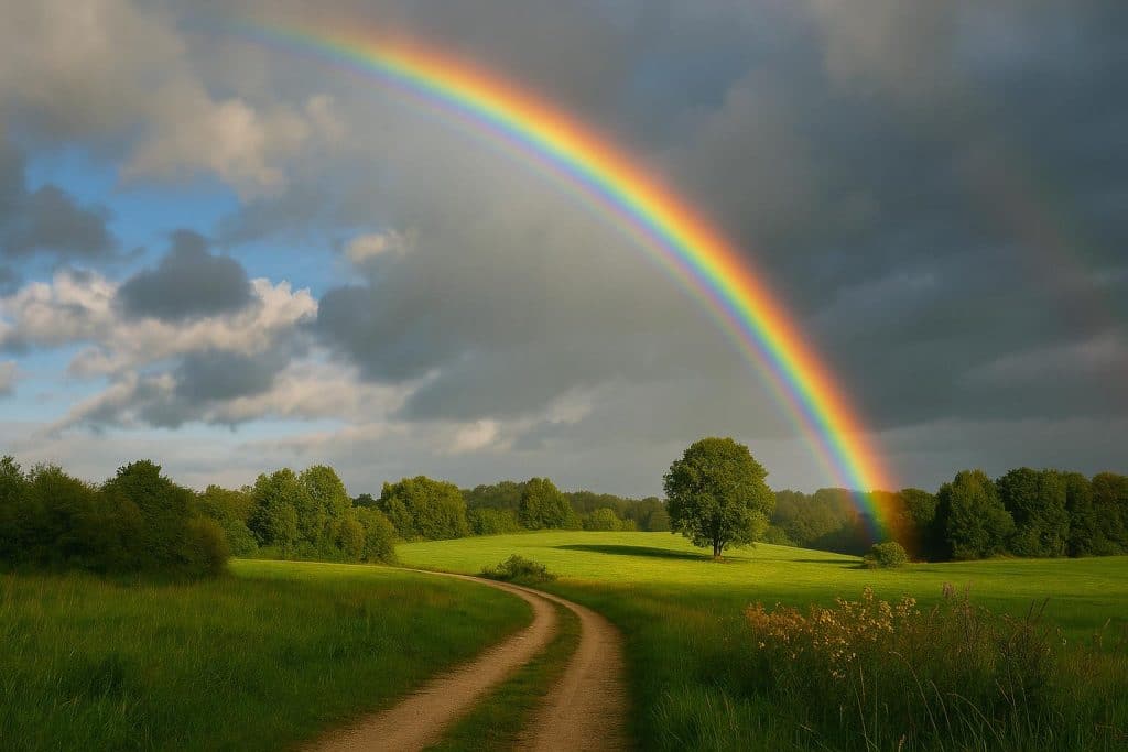
With a natural rainbow, something in the foreground makes a big difference. A field, a road disappearing into the distance, a lake or a clump of trees gives the picture depth and makes it far more interesting to look at. There is a catch. Pile in too much, and the rainbow ends up competing for attention it ought to be getting easily.
Placement matters as well. An arc set a little away from the centre usually feels livelier, while a centred one can look lovely when the landscape around it is fairly symmetrical. Moving a few steps left or right, crouching down or stepping back is often all it takes to find the version of the scene that carries the right mood.
Using Digital Editing to Enhance Rainbow Effects
Natural rainbows are beautiful, but they’re not exactly reliable. They rarely appear when they’re wanted, and they don’t always land in the most useful part of the sky. Digital editing gives photographers a bit of freedom to play with colour and light when the weather won’t play along.
A photo editor makes it easy to adjust saturation, contrast, brightness and colour balance. A few gentle tweaks can bring out a faint rainbow that’s already in the frame, or give the whole image a warmer, cooler, softer or moodier feel. What matters most is that the rainbow still looks as though it belongs to the scene around it.
For pictures without a natural rainbow, digital effects open up another option. People who want to add rainbow to photo can try editing techniques that place colourful arcs into portraits, landscapes or social media images. The results look far more believable when the rainbow’s brightness, transparency and placement match the lighting already in the original photograph.
Less really is more here. Turning every slider up to the maximum is tempting, but a rainbow that blends softly into the background usually looks better than one that seems to have been stuck on with tape.
Matching Light, Color, and Perspective
Keeping an added effect consistent with the original image is one of the trickiest parts of photo editing. A rainbow soon looks fake if it glows brighter than everything else in the frame, or if it ignores where the light is actually coming from.
Experienced editors tend to study the picture before adding anything at all. They look at the light sources, the direction of the shadows and the overall colour temperature. A photograph taken during golden hour usually suits softer, warmer tones, whereas a grey, cloudy landscape tends to need something much more muted.
Perspective matters just as much. The size and position of the rainbow have to make sense for the scene. A huge, crisp arc can swallow a small portrait whole, while a faint one may disappear entirely against a bright sky. Nudging the opacity and scale is usually what brings it all back into balance.
Depth is easy to overlook, too. When a rainbow crosses objects in the foreground, it often needs a little fine-tuning so it doesn’t look as if it’s been laid flat over every tree, rooftop and lamppost in the picture.
Creating Rainbow Portraits
Rainbow effects can bring real personality to portraits, especially for artistic projects, personal photography or themed posts on social media. A soft band of colour falling across someone’s face, for example, can give a striking look without the need for a fancy location or a room full of lighting gear.
For a natural result, it helps to keep the face clearly visible and to go easy on saturation around the eyes and skin. Nobody wants to look as though they’ve been dipped in highlighter. Softer colours tend to flatter the subject, while bolder rainbow patterns suit more experimental or fantasy-style portraits.
The background has more of a say than people expect. A plain wall lets the rainbow stand out on its own, whereas a cluttered room or a busy street means the effect has to be placed with a lot more care. Through all of it, the person’s clothing, expression and position stay at the centre of the picture.
Common Mistakes to Avoid
A handful of editing slips can quietly spoil rainbow photography. Overdoing the saturation is probably the most common, since it produces harsh, neon colours that fight with the original image. Poor placement comes a close second, particularly when a rainbow cuts straight across someone’s eyes or hides the main subject.
Mismatched lighting causes problems too. When an effect looks detached from the scene, dropping the opacity, softening the edges or shifting it to a different spot often sorts it out. Heavy-handed editing across the whole photo can do its own damage, washing out fine detail and leaving skin tones or landscapes looking slightly plastic.
One simple habit helps a great deal: flicking back to the original image every so often while editing. Small changes are much easier to keep under control, and they usually end up looking far more polished than several strong effects stacked on top of one another.
Conclusion
Rainbow photography sits somewhere between the beauty of natural light and the creative freedom of digital editing. Knowing how rainbows form, picking compositions that work and matching colours to the surroundings all help photographers produce images people genuinely enjoy looking at.
Whether the rainbow was caught in the sky or added later in post-production, the goal doesn’t change. The effect and the original photograph need to feel as though they belong together. With a careful eye on lighting, perspective, colour intensity and where the subject sits, it’s entirely possible to create images that feel expressive, balanced and a real pleasure to look at.