

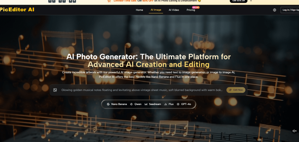
The market for AI image editors has reached a curious inflection point. There are now so many options that the act of choosing which tool to use has become almost as time-consuming as the editing itself. Do you open the background remover that handles edges well but struggles with hair? Or the upscaler that produces crisp results but adds a watermark? Or the style transfer tool that generates beautiful effects but requires a separate subscription? The paradox of choice has arrived in the creative software space, and it is quietly draining productivity. AI Photo Editor addresses this problem not by adding another option to the pile, but by consolidating the decision-making process into a single interface. Instead of asking users to choose which tool to open, it asks them what they want to achieve and handles the rest.
This approach matters because the cost of decision-making is rarely measured. Every time a creator pauses to consider which tool is best suited for a task, momentum breaks. Every time they open a new tab, log into a different account, and navigate a different interface, mental energy dissipates. The cumulative effect of these micro-decisions is significant, particularly for users who edit images regularly. The platform’s design philosophy appears to be built around minimizing these friction points. The homepage presents a clean upload area and a set of task-oriented options. There is no crowded dashboard, no intimidating array of settings, no requirement to understand which model does what. You simply upload, choose what you want to change, and describe the result. The platform decides which engine is best suited for the job.
The Hidden Tax of Tool Switching
The typical creative workflow for a single image might involve four or five different tools. Background removal in one application. Upscaling in another. Color correction in a third. Style transfer in a fourth. Each switch requires context shifting. The interface changes. The terminology changes. The credit system changes. The learning curve, even for simple tasks, resets with every new tab.
The platform consolidates these functions into a single workspace. The interface remains consistent whether you are removing a background, enhancing resolution, or applying an artistic style. The text prompt works the same way across all tools. The review process is identical. This consistency reduces the cognitive load of editing, allowing users to focus on the creative outcome rather than the mechanics of the software.
Testing the Decision-Reduction Workflow
To understand how this approach performs in practice, I ran a series of tests designed to measure not just output quality, but the mental effort required to achieve it.
The Background Removal Test
The first test involved a product image with a complex background. The platform’s background remover produced a clean cut-out with minimal artifacts. The process was straightforward: upload, select the background removal tool, and review the result. What struck me was the absence of decision-making. I did not need to choose between different removal algorithms or adjust sensitivity sliders. The platform handled those decisions automatically.
The result was not perfect on the first pass—there was a slight fuzziness around the product’s edges—but a second generation cleaned it up. The total time from upload to usable result was under a minute, and most of that time was waiting for the generation to complete rather than making decisions about how to configure the tool.
The Multi-Step Edit Test
The second test was more demanding. I needed to take a portrait, enhance the resolution, remove a distracting background element, and apply a subtle color grade. In a traditional workflow, this would require at least three separate tools. On the platform, I completed all three steps in the same workspace without re-uploading or switching interfaces.
The continuity of the workflow was the standout feature. Each step built on the previous one, and the image remained in the preview window throughout the process. I did not need to reorient myself to a new interface or remember different command structures. The experience felt more like directing an edit than operating a tool.
When the Decision-Reduction Approach Stumbles
The platform’s decision to handle model selection automatically has a downside. Power users who prefer specific models for specific tasks may find the lack of control frustrating. The platform does not always make it clear which engine is processing a request, and there is no way to override the automatic selection.
In my testing, the automatic routing worked well for most tasks, but there were instances where I would have preferred a different model. For example, a style transfer request that required photorealistic precision was routed to a model that prioritized speed over detail. The result was acceptable but not optimal. This is a trade-off that the platform has made deliberately: simplicity and speed at the cost of granular control.
How the Platform Actually Works
The platform’s usability comes down to a short, consistent process that minimizes decision-making at every step.
Step 1: Upload Your Image
The Starting Point Is the Image, Not the Tool
The upload area is the first thing you see when you land on the page. You can drag and drop a file or click to browse your device. The interface supports common formats like JPEG, PNG, and WebP. Once the image loads, it appears in a preview window with tool icons arranged along the side. The platform does not ask you to choose a model upfront. That decision happens behind the scenes based on the task you select.
No Account Required for Initial Testing
You can upload, edit, and download results without creating an account. This lowers the barrier to entry considerably and allows you to test the platform before committing to a subscription. For quick edits on a single image, this friction-free approach is a significant advantage.
Step 2: Select Your Edit Type
Task-First Organization Keeps Things Simple
The tool icons include background removal, object erasure, image enhancement, style transfer, and video generation. The site organizes entry points by task rather than by model. A user who wants to erase an object goes to Object Eraser. A user who wants a painting effect opens Style Transfer. This task-first structure means the platform decides which underlying models are appropriate for each job; the user does not need to know which engine handles which operation.
The Text Prompt Replaces Configuration
Instead of adjusting sliders and settings, you describe what you want in natural language. This replaces a complex configuration process with a simple instruction. The quality of the output correlates with the clarity of the prompt, but the process of creating the prompt is far simpler than learning the parameters of different models.
Step 3: Generate and Iterate
Results Appear in Seconds
Most edits complete within seconds. The edited image appears alongside the original, allowing for side-by-side comparison. If the result is not quite right, you can tweak the prompt and regenerate. The speed of generation encourages iteration, which reduces the pressure to get it right on the first try.
Iteration Is Encouraged
The platform does not punish exploration. Each generation is fast enough that you can try multiple variations without feeling like you are wasting time. This encourages a more experimental approach to editing, where you are not afraid to try something that might not work.
A Candid Look at Where the Platform Hesitates
No decision-reduction system is perfect, and this one has several limitations that became apparent during testing.
First, the quality of the output is heavily dependent on the quality of the input. Low-resolution or heavily compressed photos produce softer results regardless of which model is used. A clean, well-lit source image gives the AI a clearer target than a noisy, crowded, or low-resolution image.
Second, the automatic model selection does not always choose the optimal engine for every task. Power users who prefer specific models for specific jobs may find the lack of control frustrating. The platform’s design philosophy prioritizes simplicity over transparency, and that trade-off will appeal to some users more than others.
Third, complex edits involving multiple objects or intricate backgrounds may require multiple generations to get right. The AI does not always understand the full context of a scene, and it can occasionally misinterpret ambiguous prompts. This is a platform-agnostic limitation rather than a product flaw.
Fourth, the video generation features are still evolving. While they produce impressive results for simple animations, longer or more complex sequences may exhibit inconsistencies. The feature is best approached as a creative enhancement rather than a production-grade video tool.
Finally, the free tier has limits on concurrent generations and processing priority. For occasional use, these limits are unlikely to be an issue, but heavier users will likely find value in the paid plans.
Comparing the Decision-Reduction Approach to Traditional Workflows
To put the platform’s approach in perspective, it helps to compare it against conventional photo editing software and single-purpose AI tools. The following table summarizes the key differences.
| Aspect | PicEditor AI | Traditional Software | Single-Purpose AI Tools |
| Decision Points | Minimal; task-first organization | Numerous; every adjustment requires a choice | Moderate; each tool has its own decisions |
| Learning Curve | Shallow; describe what you want | Steep; requires training | Varies; each tool has its own interface |
| Tool Switching | None; all tools in one workspace | Requires separate workflows | Requires opening new tabs |
| Creative Control | High-level direction | Granular control over every pixel | Limited to their specific function |
| Best Use Case | Quick edits, multi-step workflows | Professional retouching | One-off single edits |
| Mental Effort | Low; focus on outcome | High; focus on process | Medium; context switching |
Who Benefits Most from Reduced Decision-Making
Based on my testing, the platform’s decision-reduction approach is best suited for three groups of users.
Content creators who edit images regularly will appreciate the reduced cognitive load. The consistency of the interface and the elimination of tool switching allow for a more fluid creative process.
Casual users who want to improve their photos without learning complex software will find the platform intuitive. The task-first organization and natural language prompts make it easy to get started without any prior experience.
Busy professionals who need to produce results quickly will value the speed of the workflow. The platform minimizes the time spent on configuration and decision-making, allowing users to focus on the creative outcome.

The Value of Not Having to Choose
The broader point is that the proliferation of AI editing tools has created a new problem: decision fatigue. The platform addresses this by consolidating the decision-making process into a single interface. You do not need to choose which tool to open, which model to use, or which settings to adjust. You simply describe what you want and let the platform handle the rest. AI Photo Edit does not claim to offer more control than traditional software. What it offers is less friction, fewer decisions, and a more direct path from idea to result. For users who value efficiency over granularity, that is a meaningful improvement.